Sparitual: Packaging Design Refresh & Launch
Before
Sparitual is a well-known brand in the spa and professional nail industry, but their packaging had begun to feel dated and no longer reflected the modern wellness space they were part of. As the beauty and spa industries evolved toward more refined, minimal aesthetics, the brand needed packaging that felt contemporary while still maintaining the calm, natural spirit that Sparitual was known for.
Process
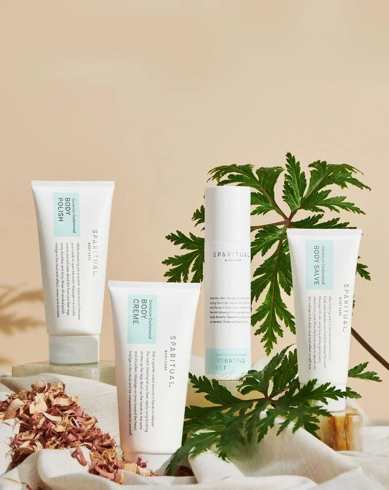
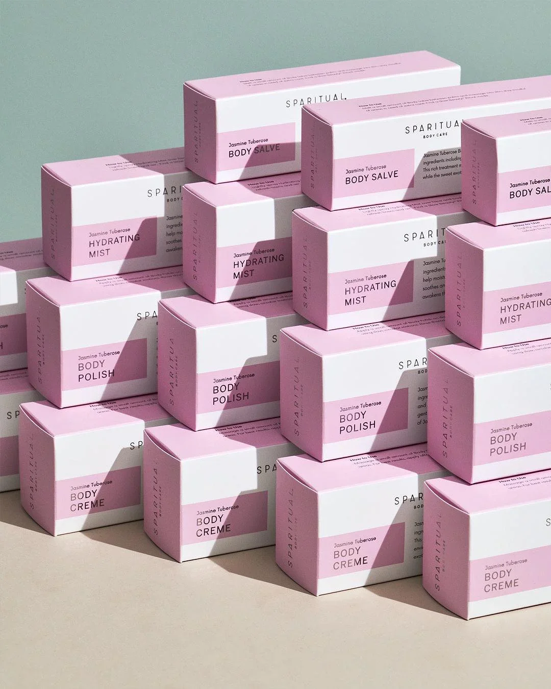
We refreshed the packaging system to bring the brand into the present while preserving its core identity. The design focused on simplifying the visual language, refining typography, and creating a more modern color and layout system that felt clean, calm, and aligned with the spa environment. The updated packaging maintained the brand’s focus on natural ingredients and wellness while elevating the overall look and feel.
Result
The refreshed packaging gave Sparitual a more modern and cohesive presence across its product line. The updated design felt at home in contemporary spa and retail environments, helping the brand reconnect with a new generation of beauty and wellness consumers while reinforcing its reputation as a premium spa brand.