RED HOT CHILI PEPPERS
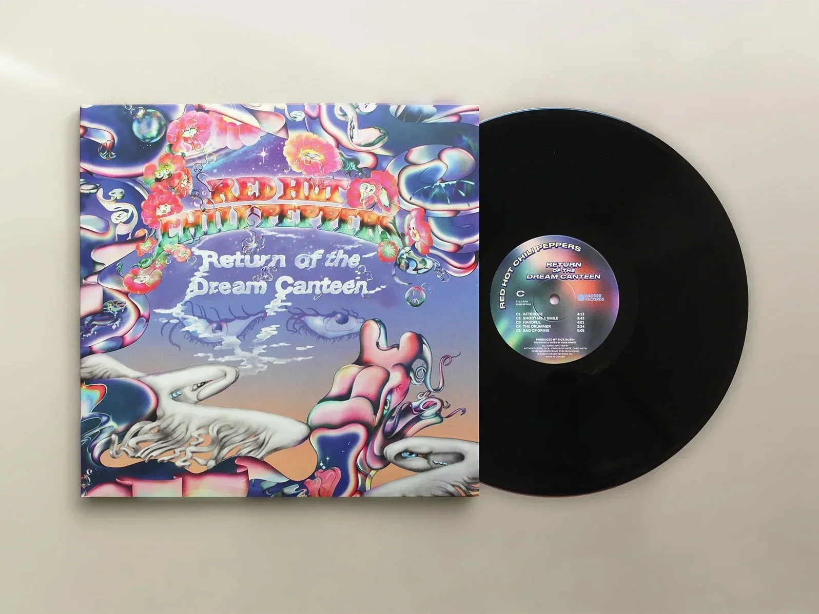
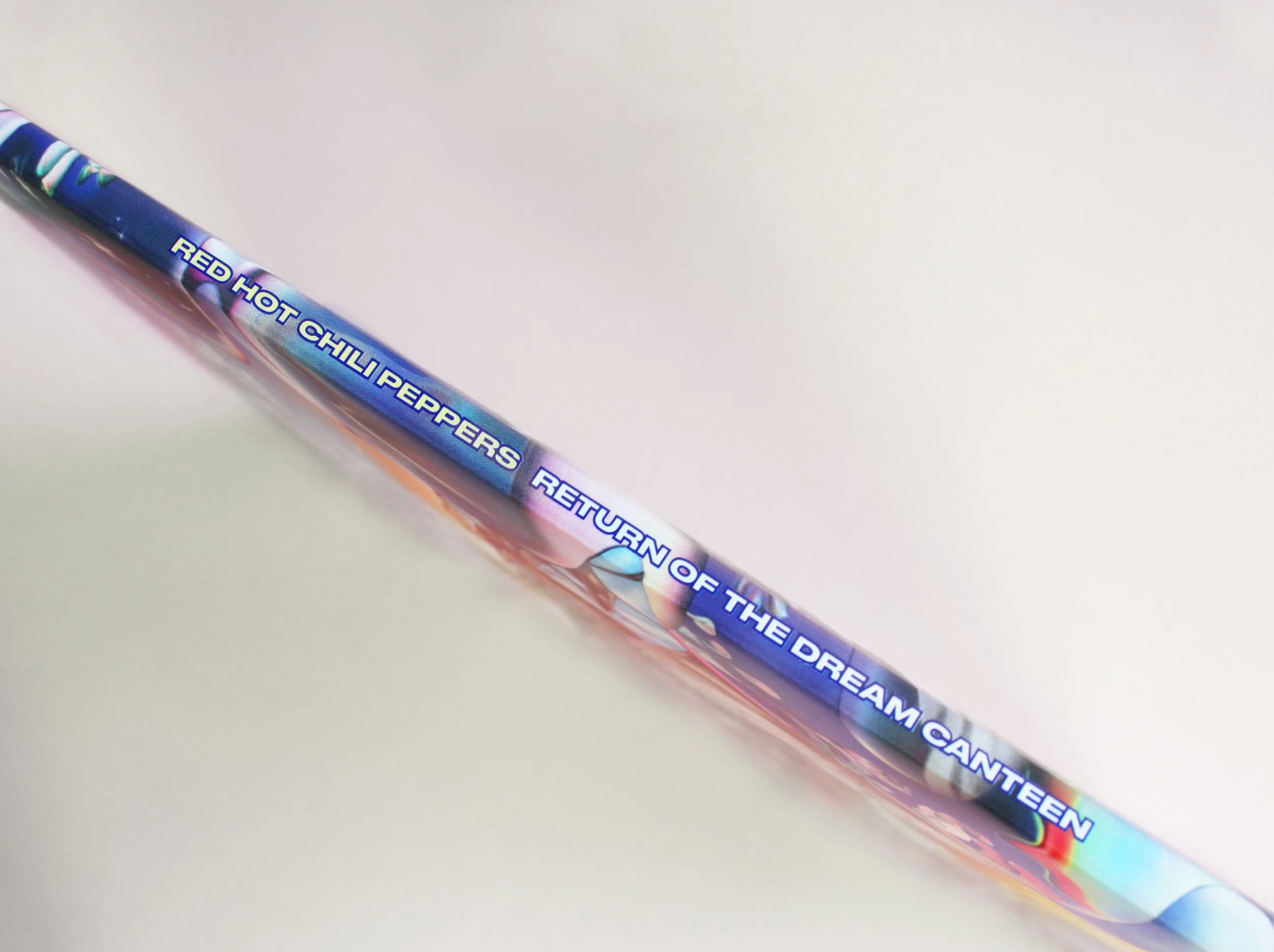
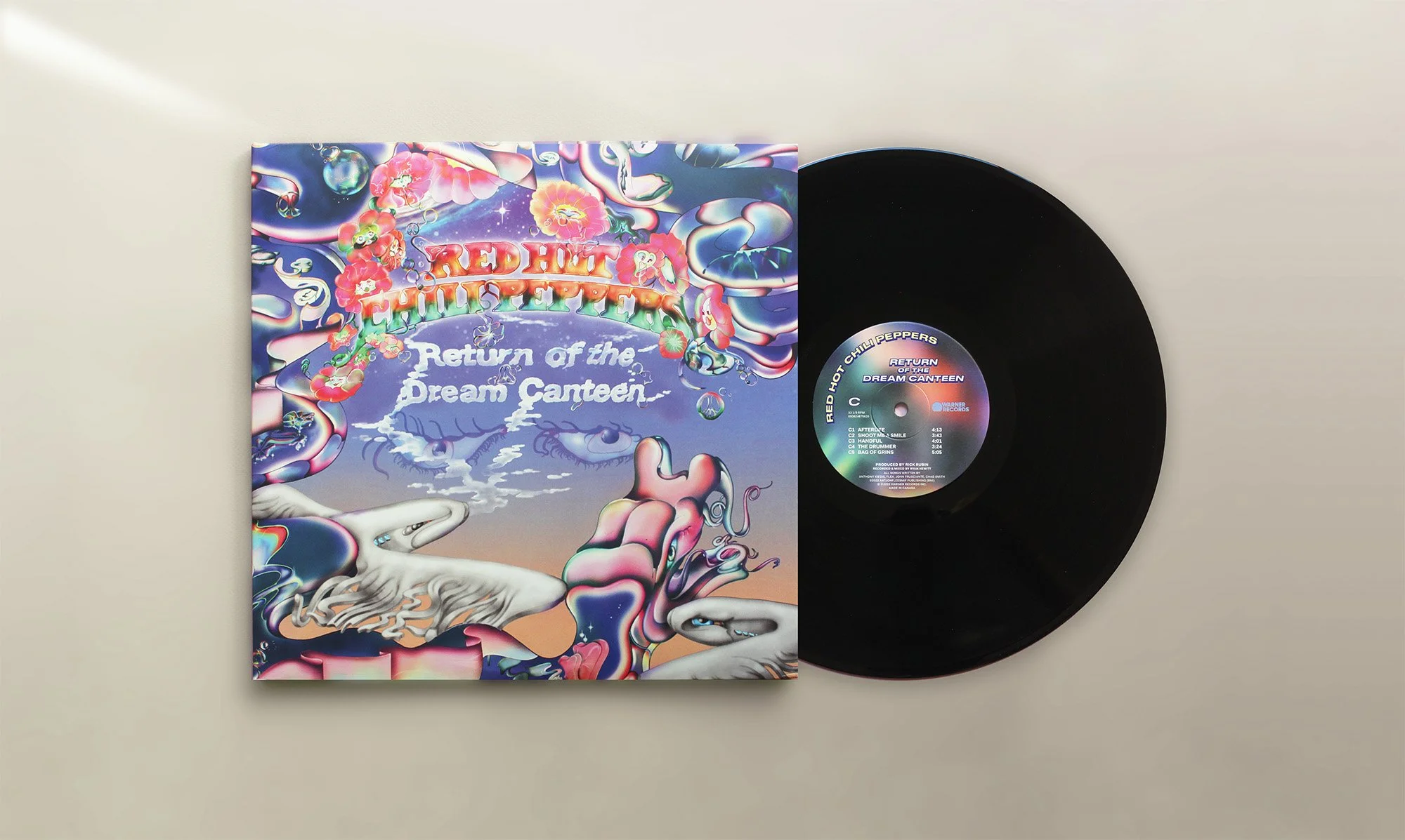
Before Red Hot Chili Peppers needed a complete visual identity for their album Return of the Dream Canteen — one that could live across vinyl packaging, tour visuals, and a full marketing campaign while feeling as iconic as the band itself.
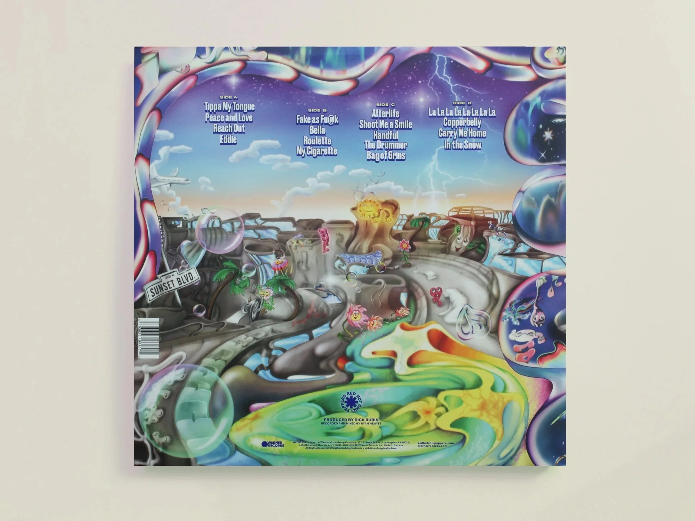
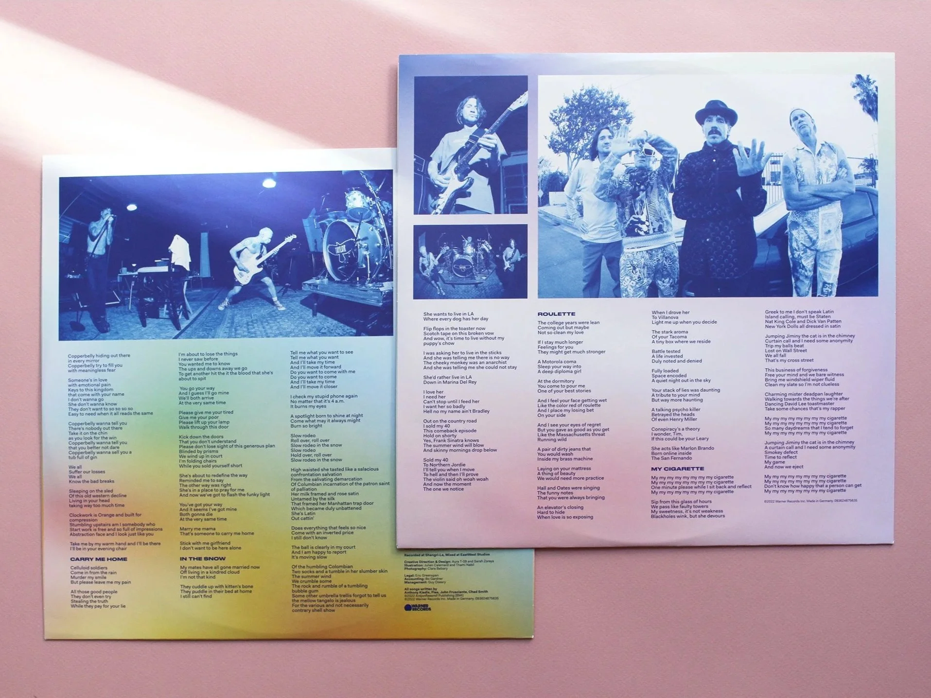
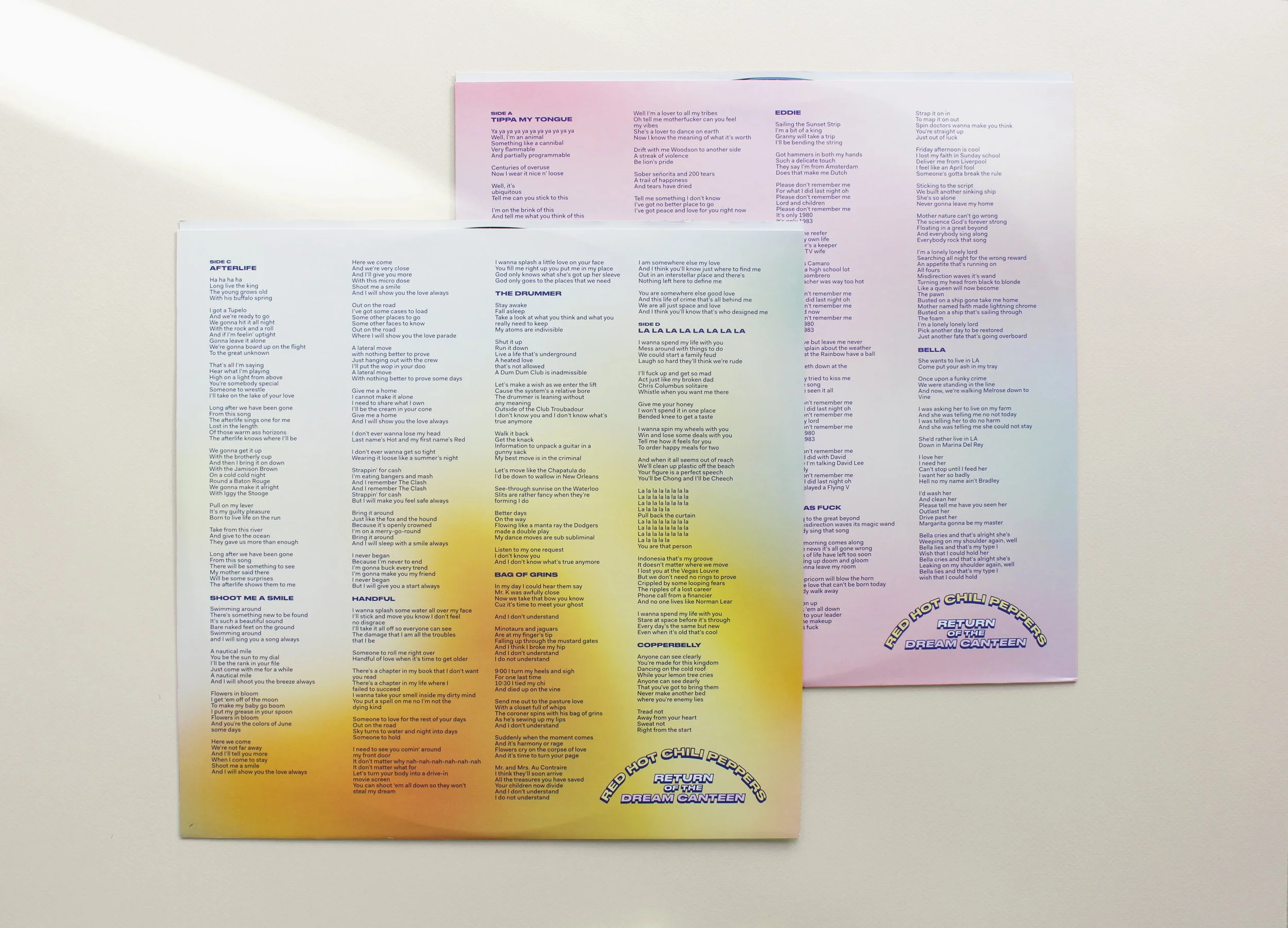
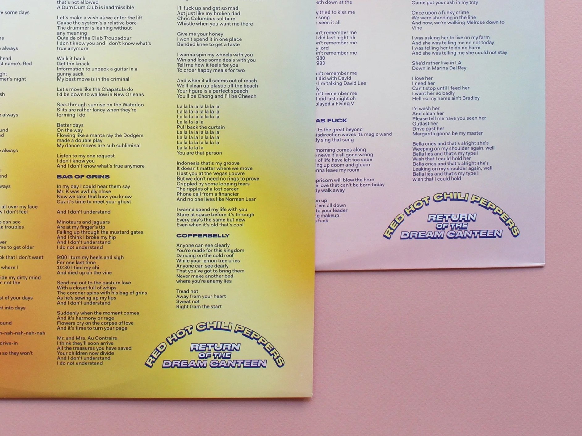
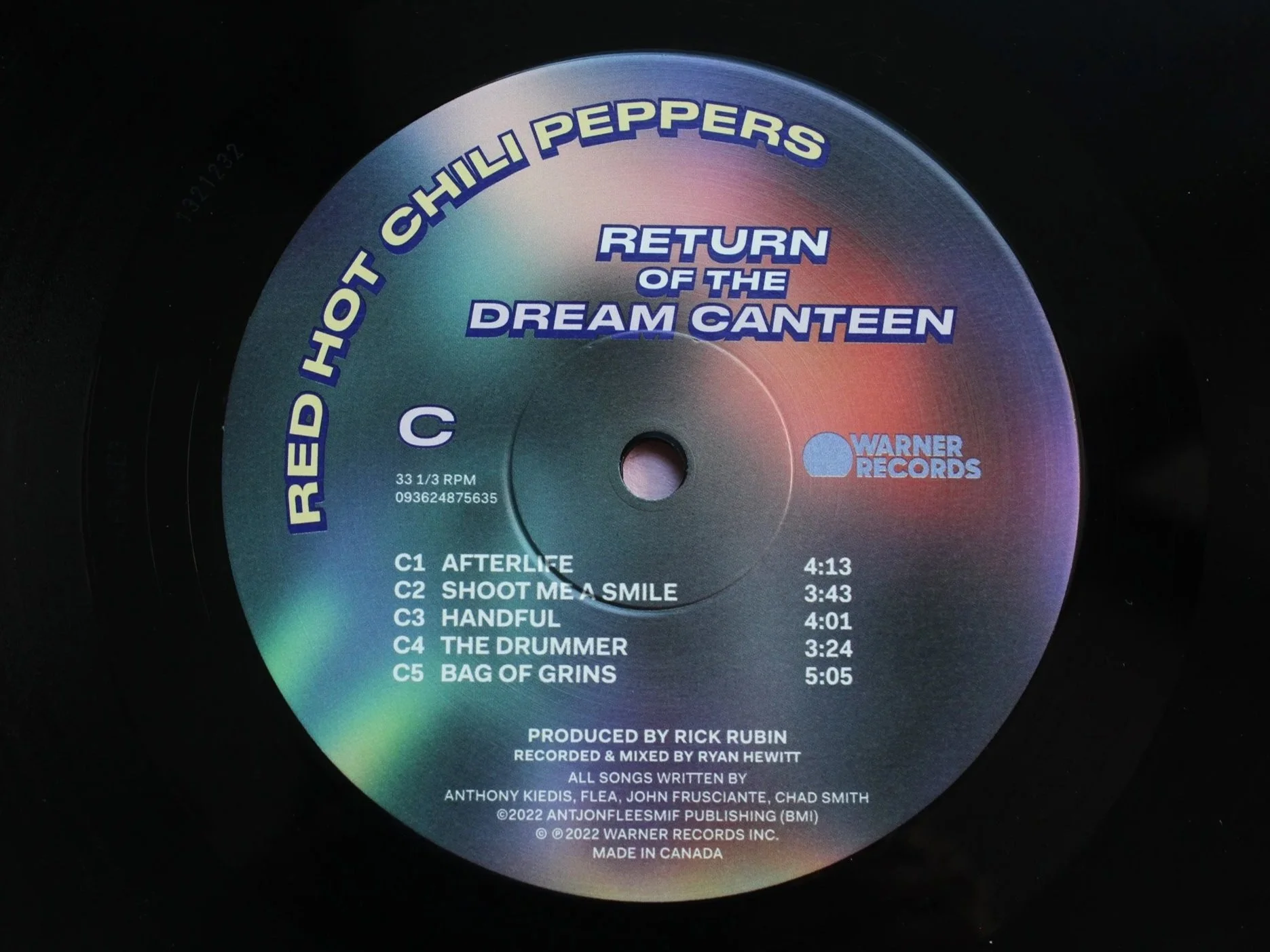
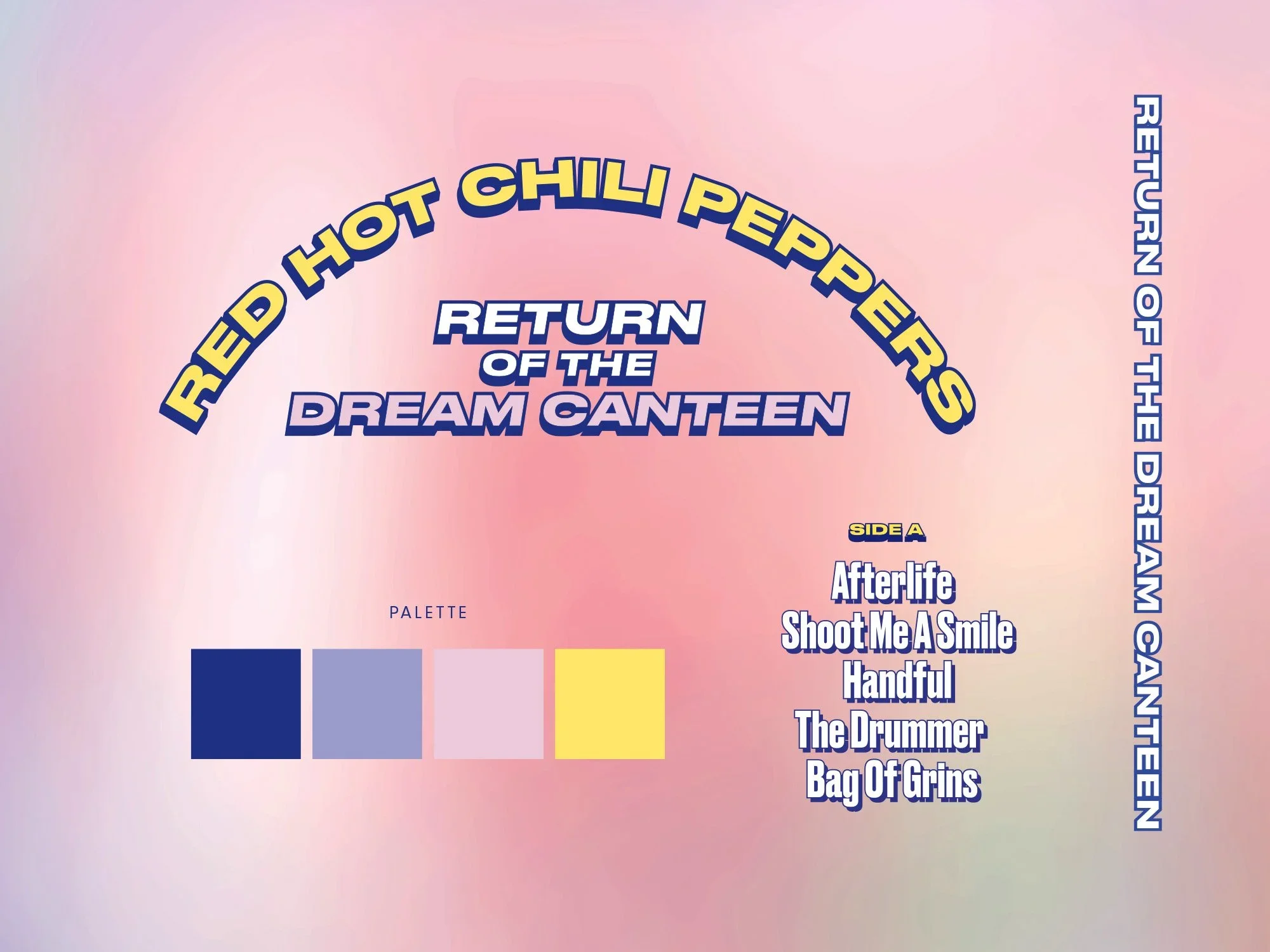
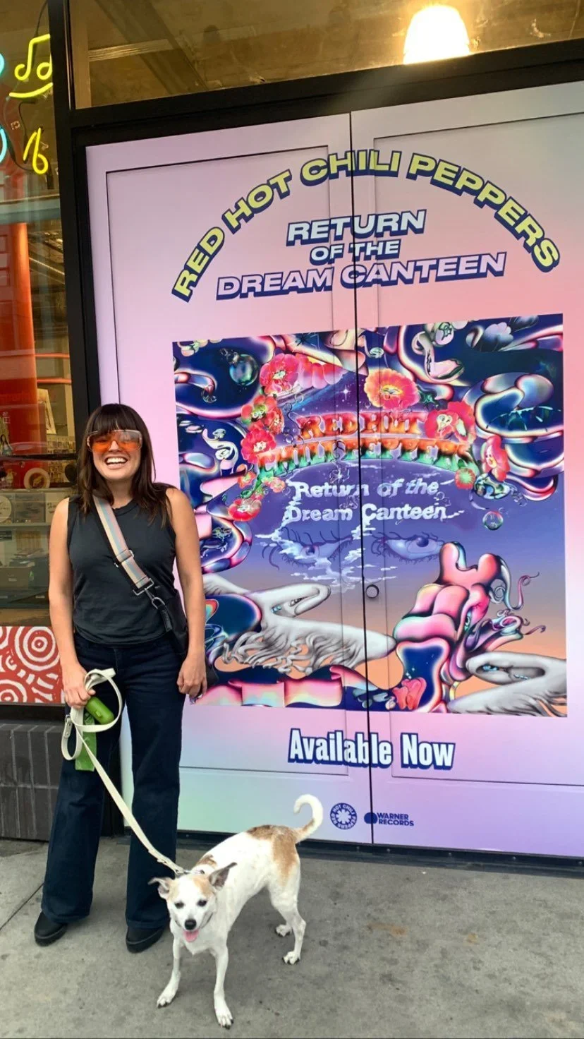
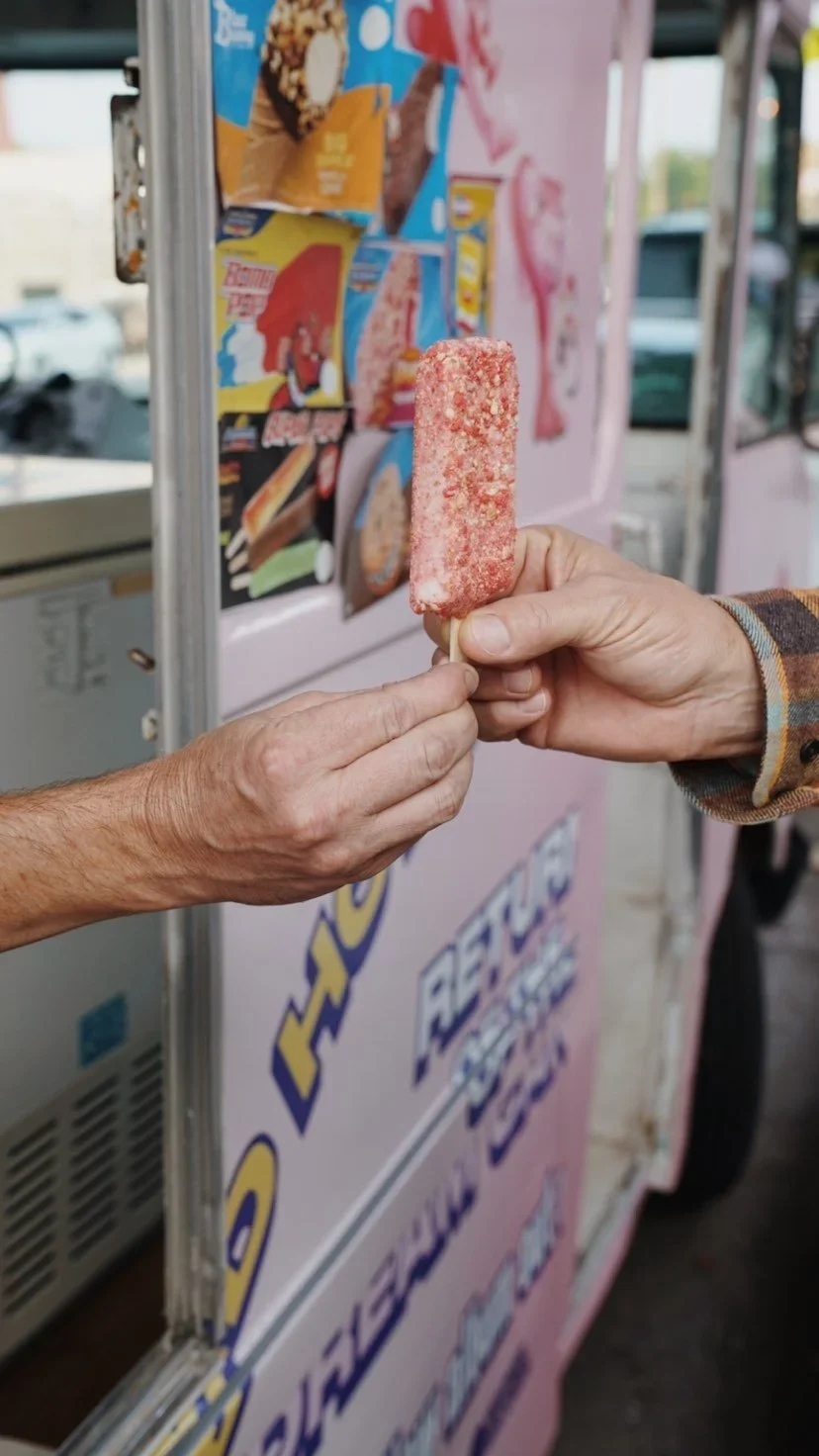
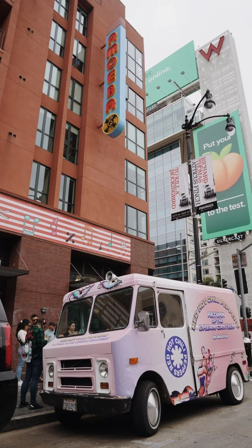
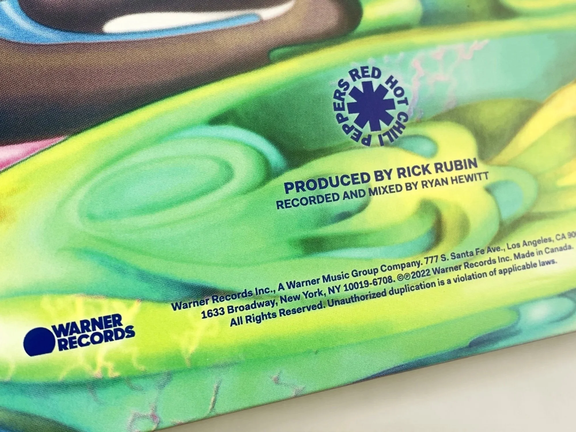
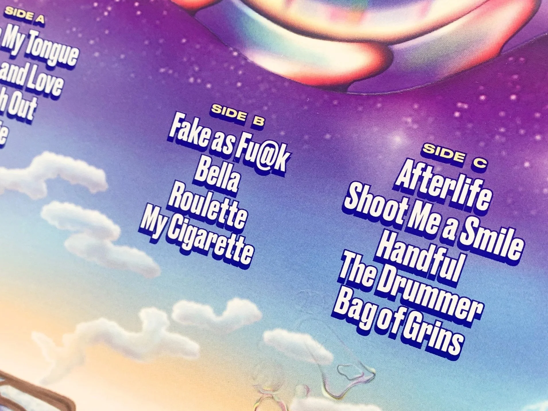
Process We developed an identity system built around a central illustration, using it as the foundation for everything that followed. Custom Pantones and color vinyl were specified to give the physical packaging a collector-quality feel, with color playing a central role in the visual language. From there, the identity system expanded into a full campaign — tour visuals, marketing collateral, and supporting assets that all drew from the same visual world, creating a cohesive and recognizable presence across every touchpoint.
Result The finished identity gave the album a bold, distinctive look that extended far beyond the record itself. The campaign brought the illustration and color system to life at scale — across stages, screens, and print — reinforcing the band's visual legacy while giving Return of the Dream Canteen its own unmistakable identity.