Vital Body: Packaging Design & Brand Refresh
Before
When we began working with Vital Body, they had recently refreshed their packaging and it looked elegant and refined. The problem was that it didn’t stand out on the shelf in retail environments. Most of their retail placements were in spa settings, which are very clean and minimal, so the quiet design blended into the surroundings instead of catching attention. They had a similar issue in natural food stores, where the packaging lacked the visual impact needed to draw customers in.
Process
Initially, we were brought in to create illustrations that would appear on the side panel of the packaging as a way to express the feeling behind their healing CBD products. The brand had attempted to create the artwork several times but hadn’t found the right approach. Our poster-style illustration worked well for the side panel and captured the tone they were looking for.
After the packaging launched, Vital Body realized the illustrations had become a key visual element of the brand. At retail, they began displaying the products with the illustrated panel facing forward, and even used the same approach on their shipping boxes.
Result
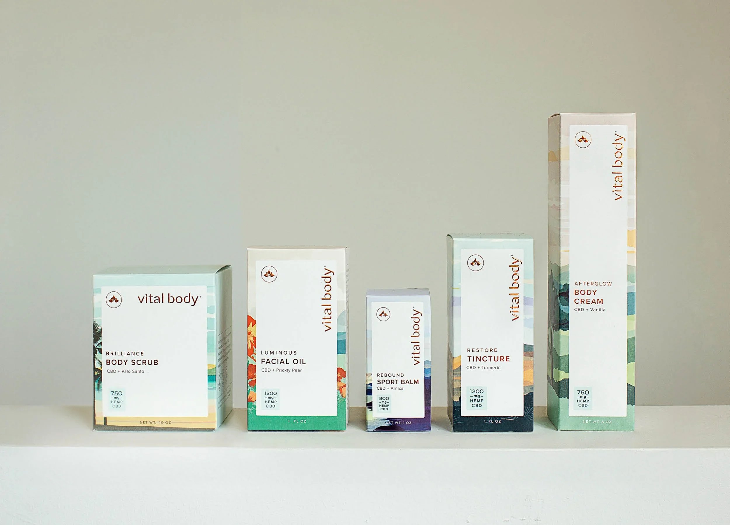
Over time, the team realized that the original quiet luxury packaging wasn’t attracting the attention they wanted. They decided to elevate the illustrations and asked us to redesign the packaging, starting with their CBD gummies and eventually expanding across the entire product line.
The redesign introduced a system of poster-style landscape illustrations inspired by the California environment where the brand is based, reinforcing their origin story. We also developed a set of icons that communicate key product benefits. The new packaging brought more visual presence to the shelf, helped the brand gain placement in Whole Foods, and increased online sales.
Today, the illustrations are a central part of the Vital Body brand system and have helped significantly increase both the value of the company and its sales.